In today's digital age, where internet accessibility extends beyond traditional desktops to a myriad of devices, ensuring that your website provides an optimal user experience across all platforms is crucial. This is where responsive design solutions come into play, offering a seamless viewing experience regardless of the device in use.
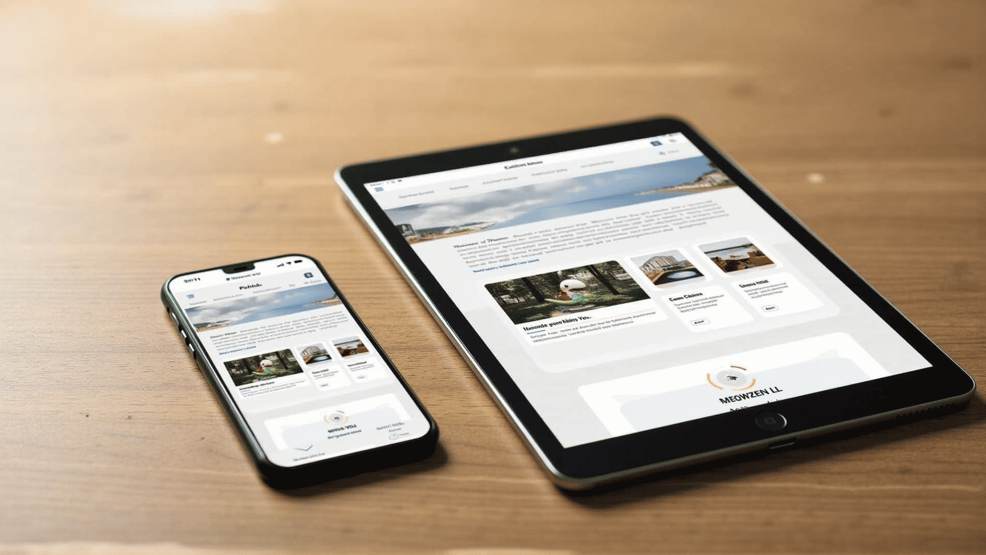
Responsive design is the art of creating web pages that detect the visitor’s screen size and orientation and change the layout accordingly. This adaptability ensures that whether a visitor accesses a site via a smartphone, tablet, laptop, or desktop, the website’s functionality and aesthetics remain intact.
One of the foremost advantages of responsive design is improved user experience. A site that is cumbersome to navigate or partially visible on a mobile screen can frustrate users, driving them to competitors’ sites. Responsive design eliminates these frustrations by optimizing navigation, load times, and content presentation for all screen sizes. This user-oriented approach naturally leads to increased engagement, prolonged site visits, and ultimately, higher conversion rates.
Moreover, responsive design is highly beneficial for search engine optimization (SEO). Google, which commands the bulk of the search engine market, prefers websites that are mobile-friendly because they contribute to a positive user experience. A single responsive site eliminates the need for multiple versions of a site for different devices, simplifying SEO efforts with uniform content and consistent website metrics.
The technical implementation of responsive design involves fluid grids, flexible images, and CSS media queries. Fluid grids allow layout elements to resize proportionally, rather than sticking to fixed dimensions. Flexible images and media adjust within the confines of a grid column, adapting to any screen size. CSS media queries enable the application of different styles based on the characteristics of the device, such as the viewport width.
Transitioning to a responsive design not only future-proofs your website by accommodating a continually growing variety of devices but also reduces maintenance time. Managing one website that adapts to all devices is far more efficient than managing separate sites for mobile and desktop.
With the increasing reliance on mobile devices for web browsing, investing in a professional responsive design is not just beneficial but essential. Businesses that wish to remain competitive and provide their users with an exceptional browsing experience must recognize the importance of a responsive web presence.
In conclusion, adopting responsive design solutions is a strategic move towards enhancing user experience, boosting SEO effectiveness, and simplifying digital content management. By ensuring that your website is fully accessible and functional on every device, you are not only expanding your potential reach but also demonstrating a commitment to meeting the needs of your audience, whatever their preferred platform may be.